Project Description:
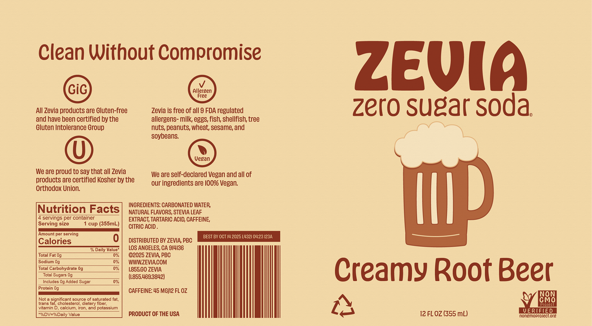
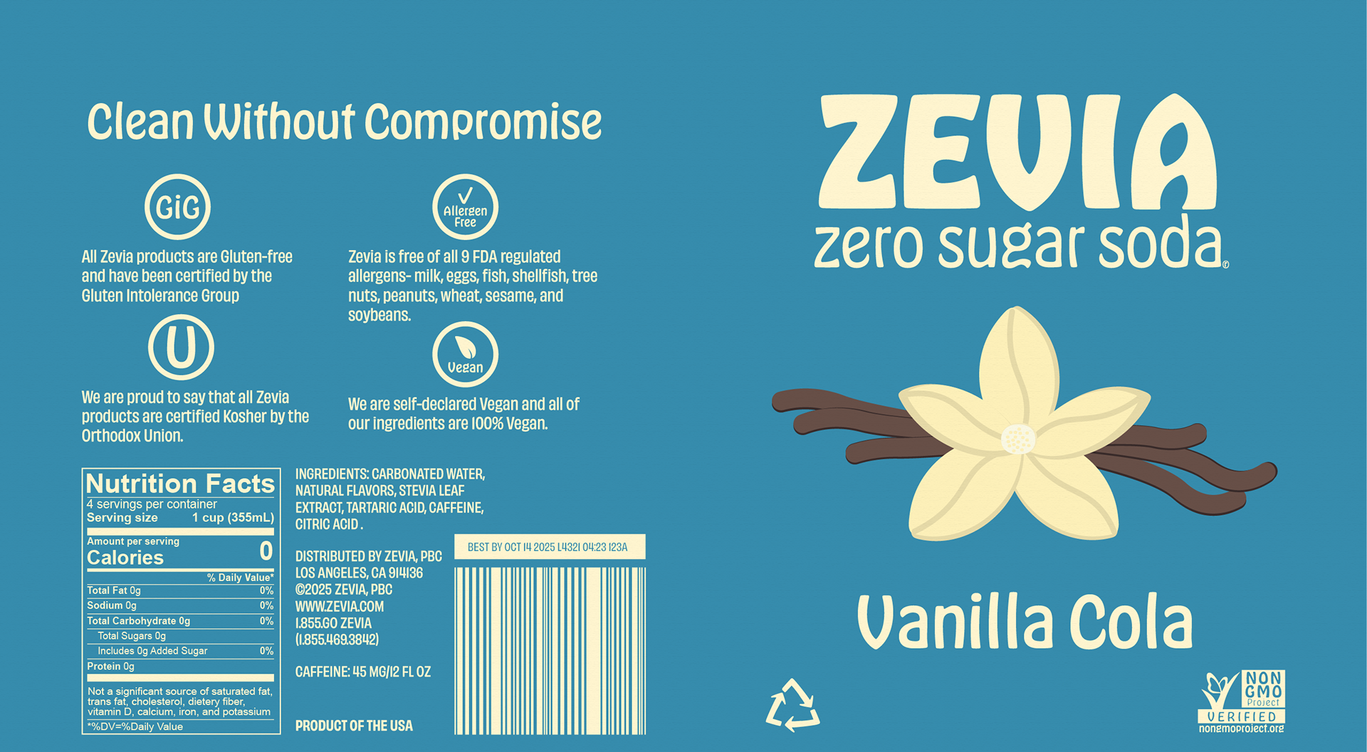
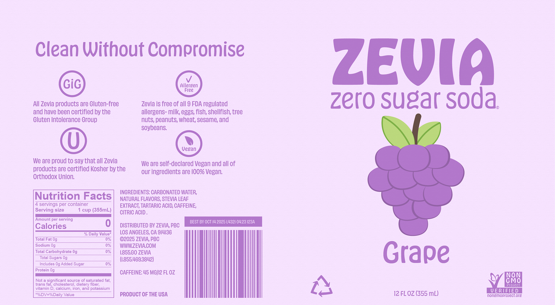
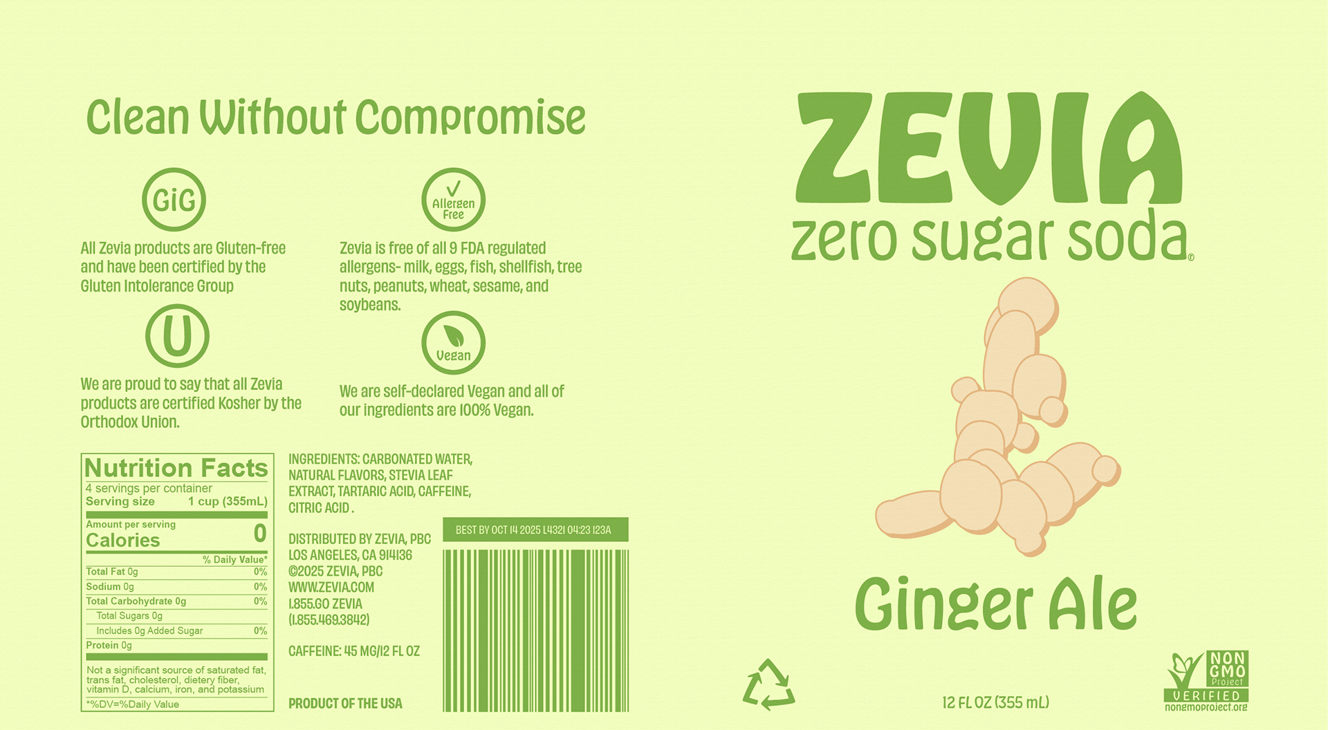
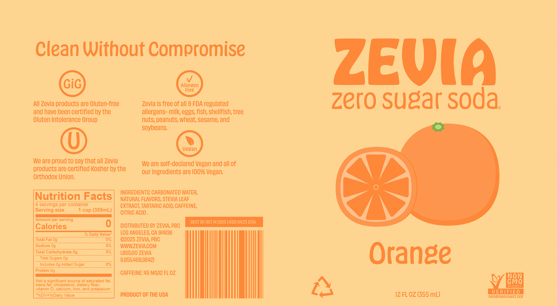
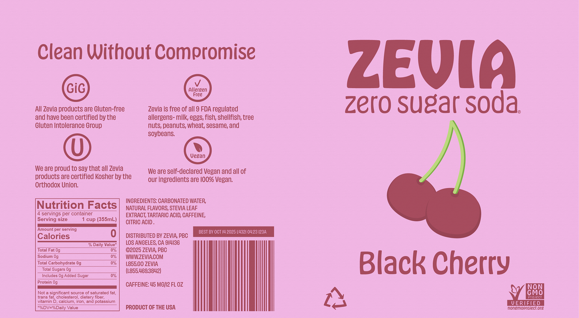
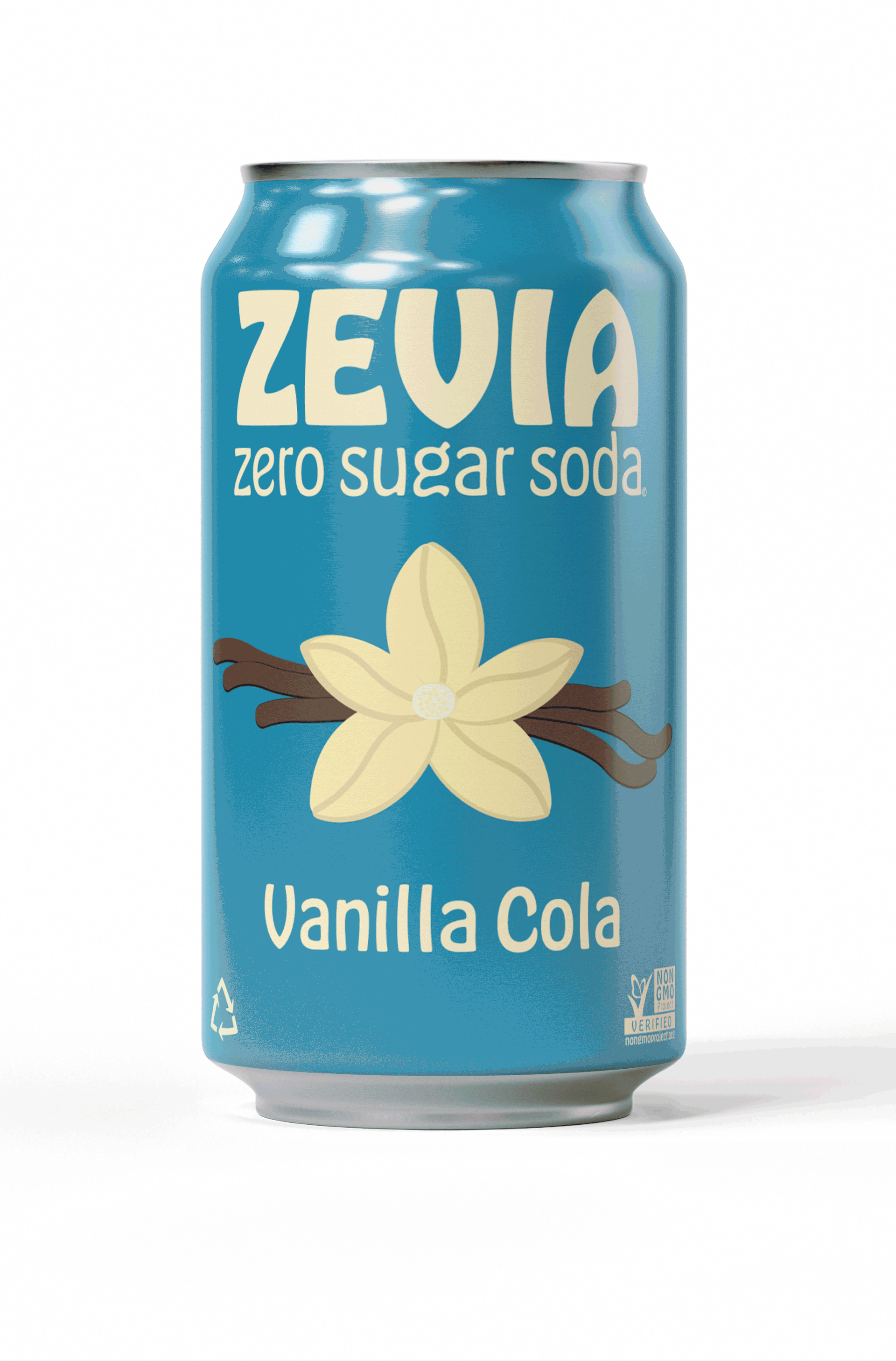
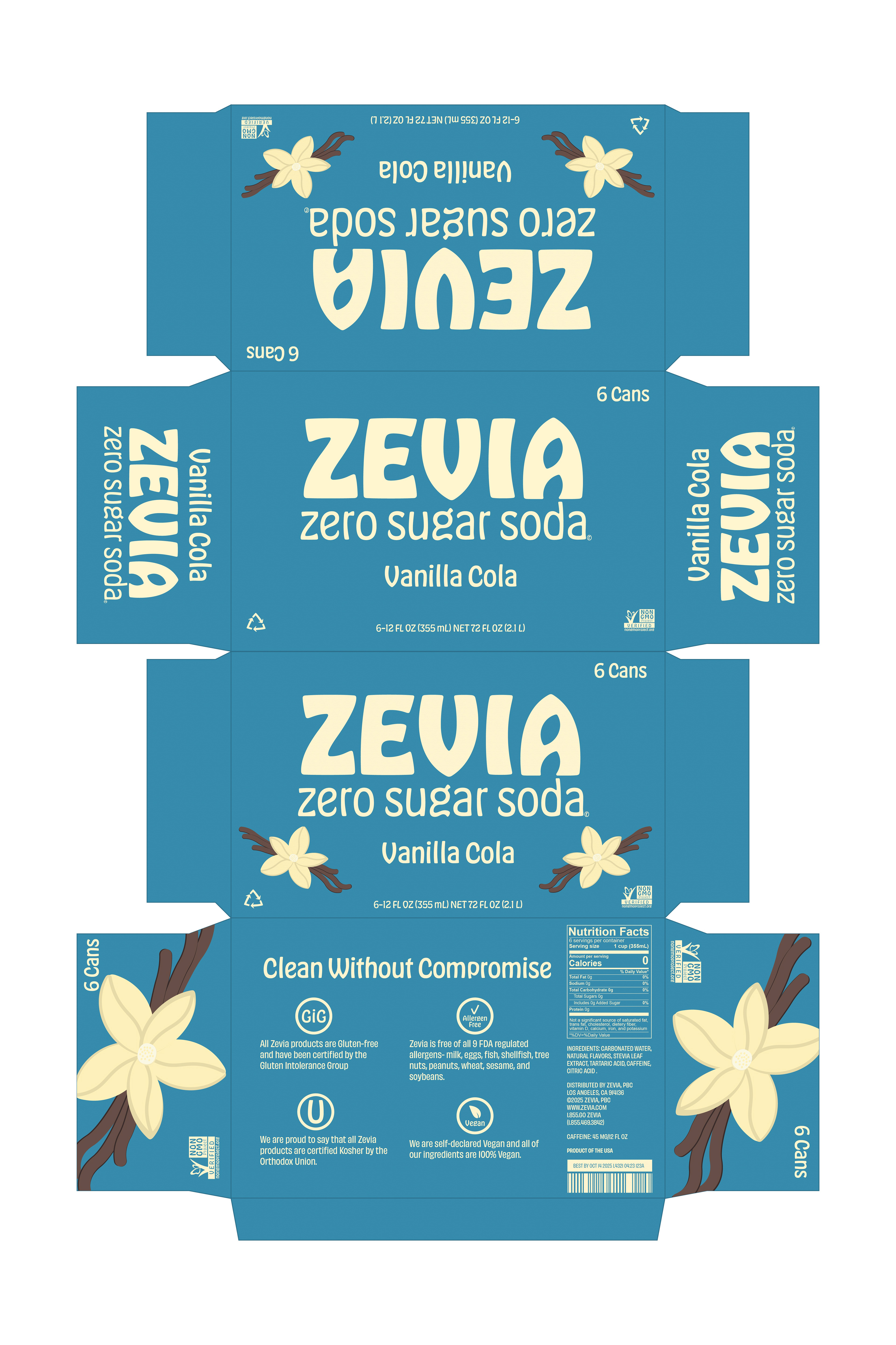
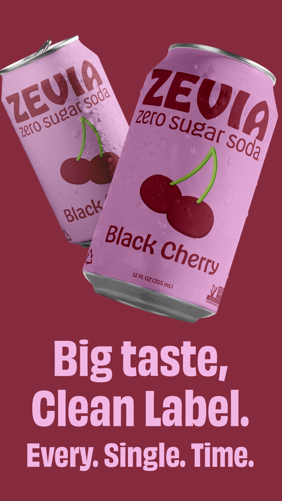
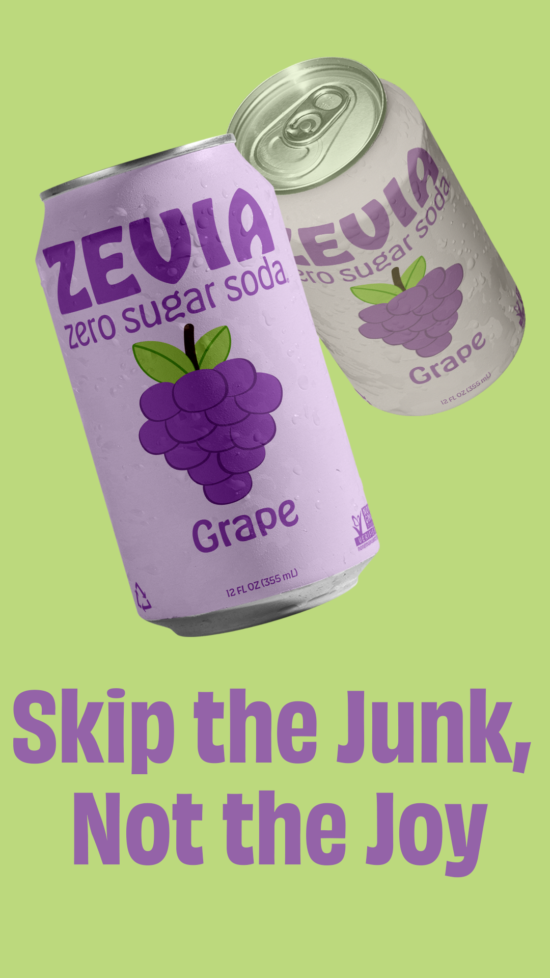
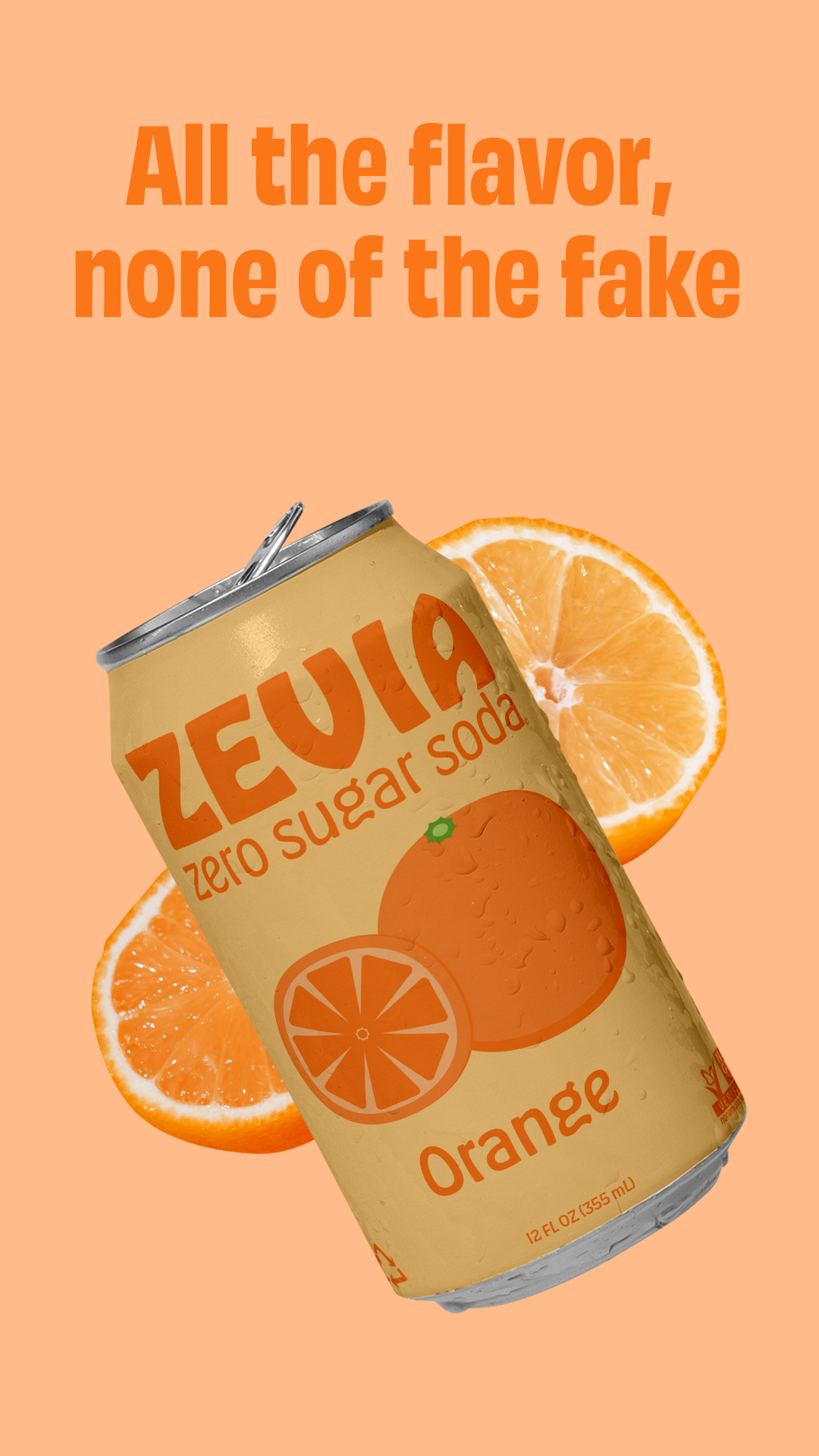
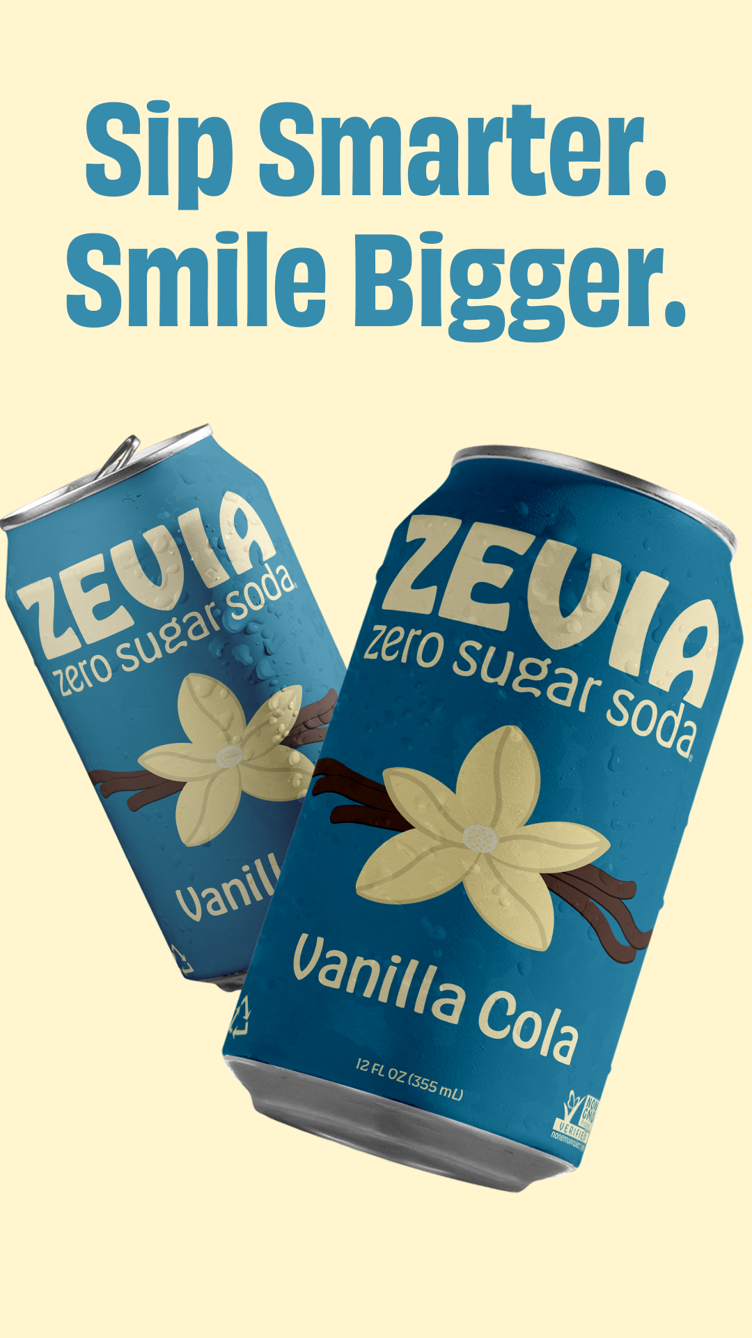
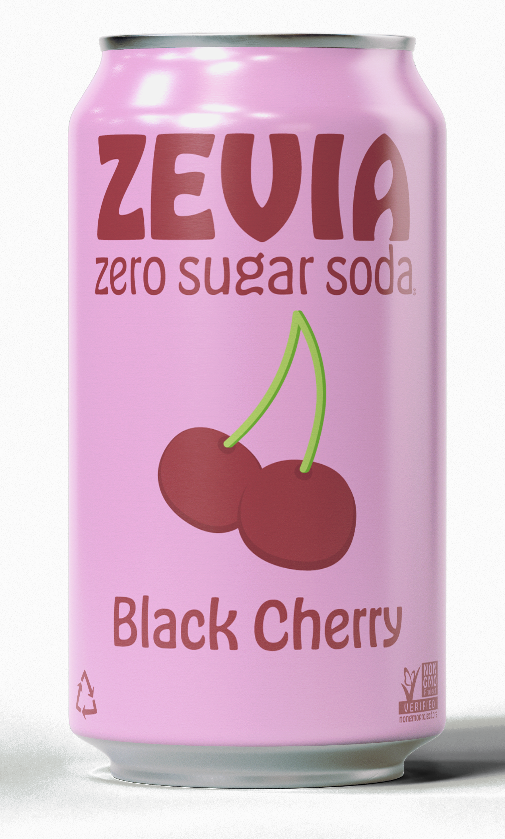
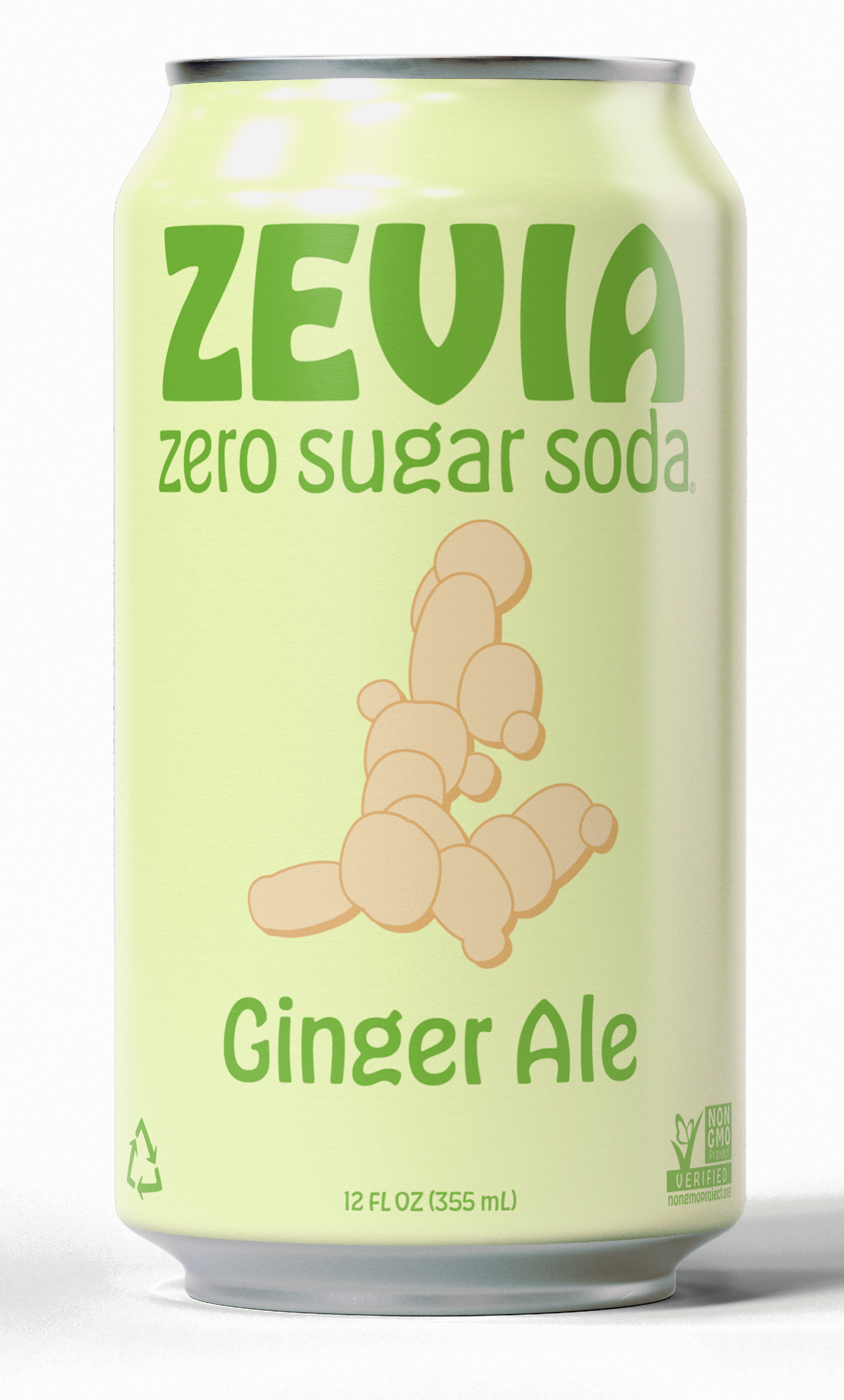
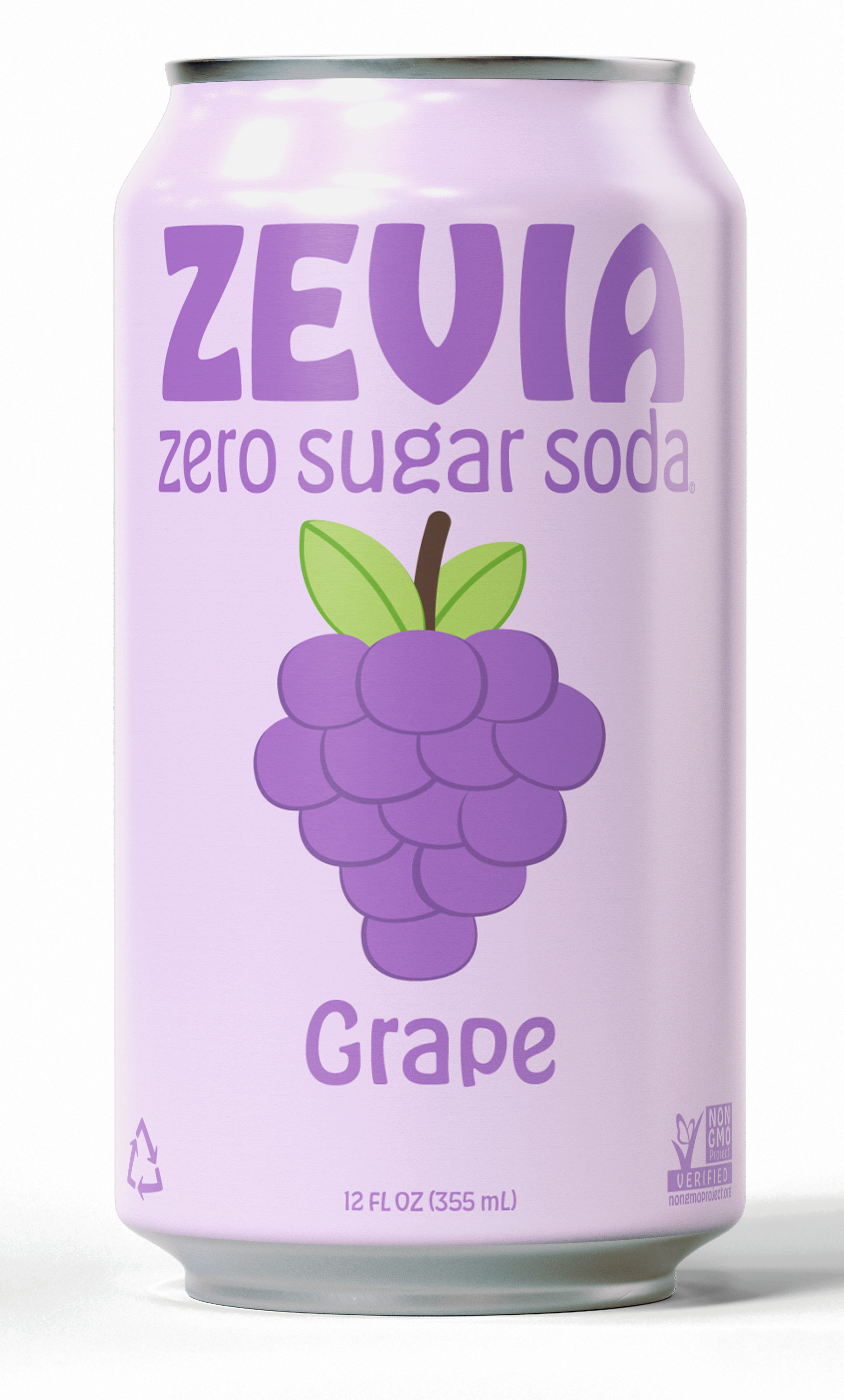
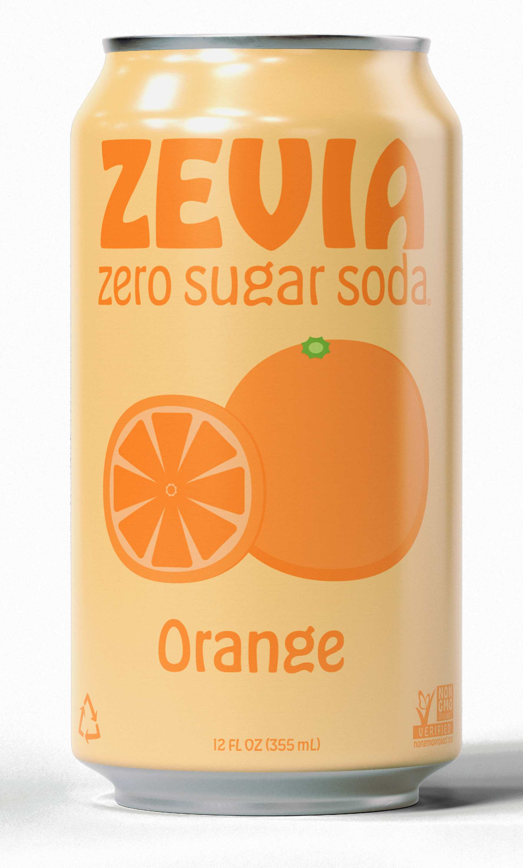
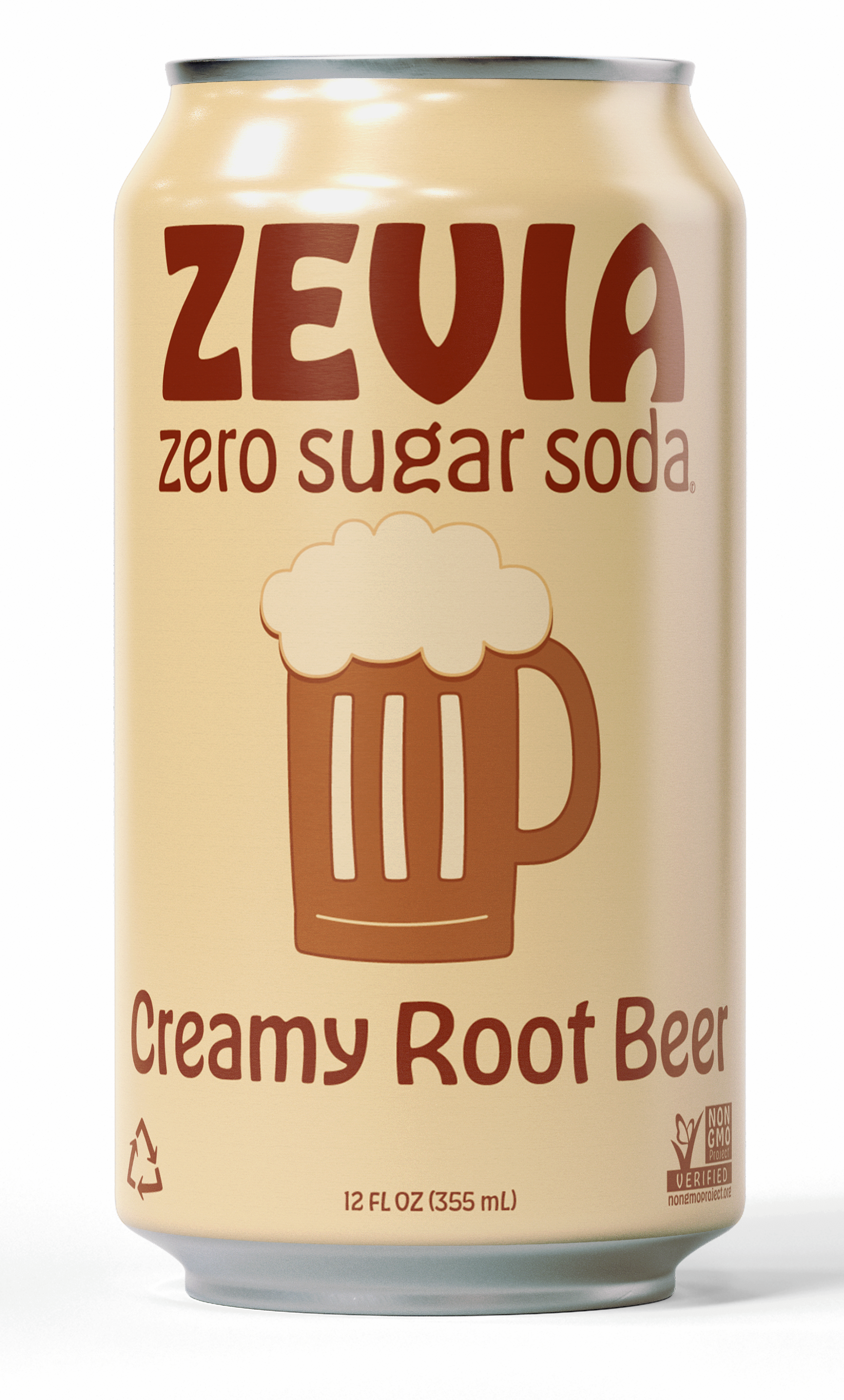
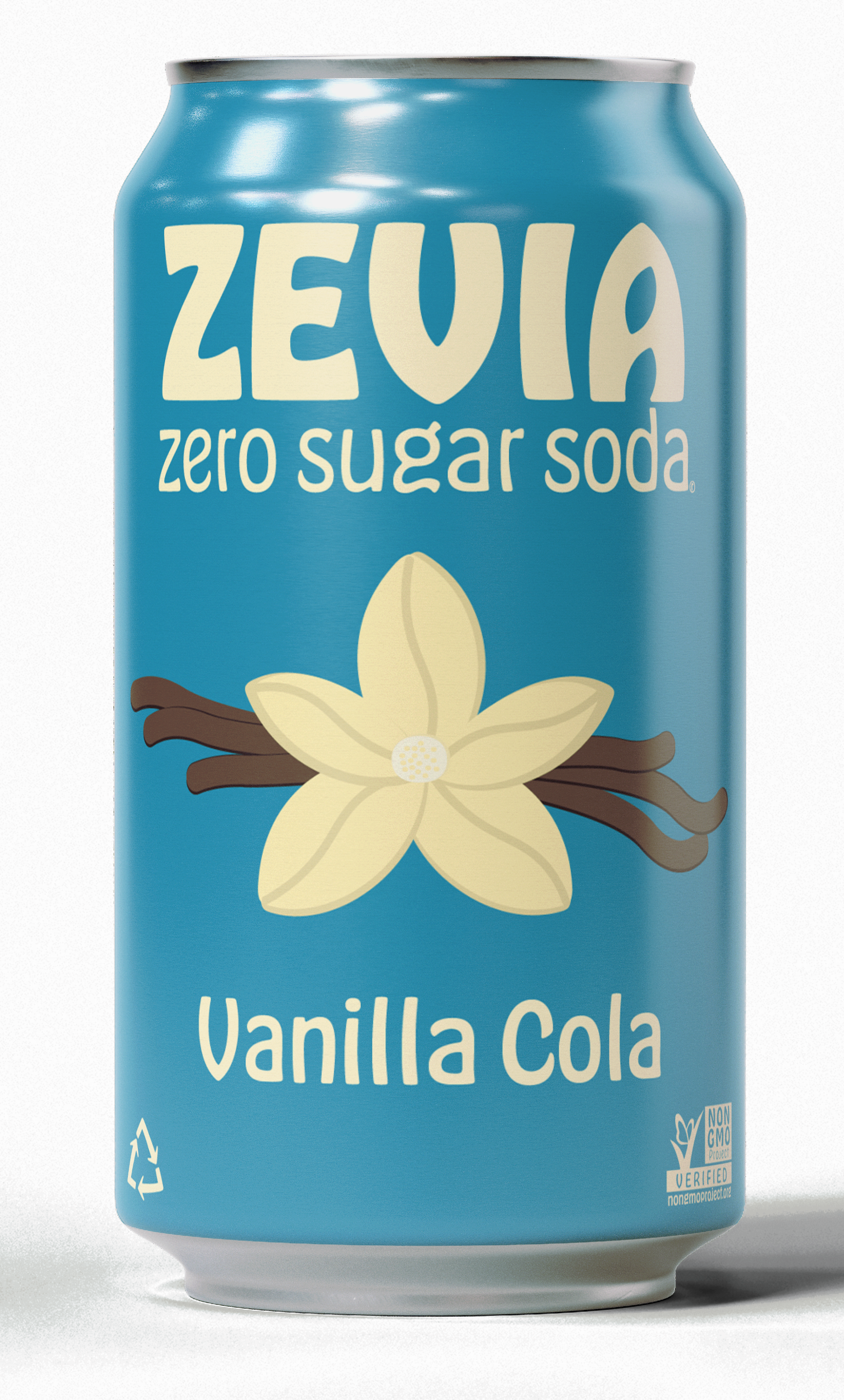
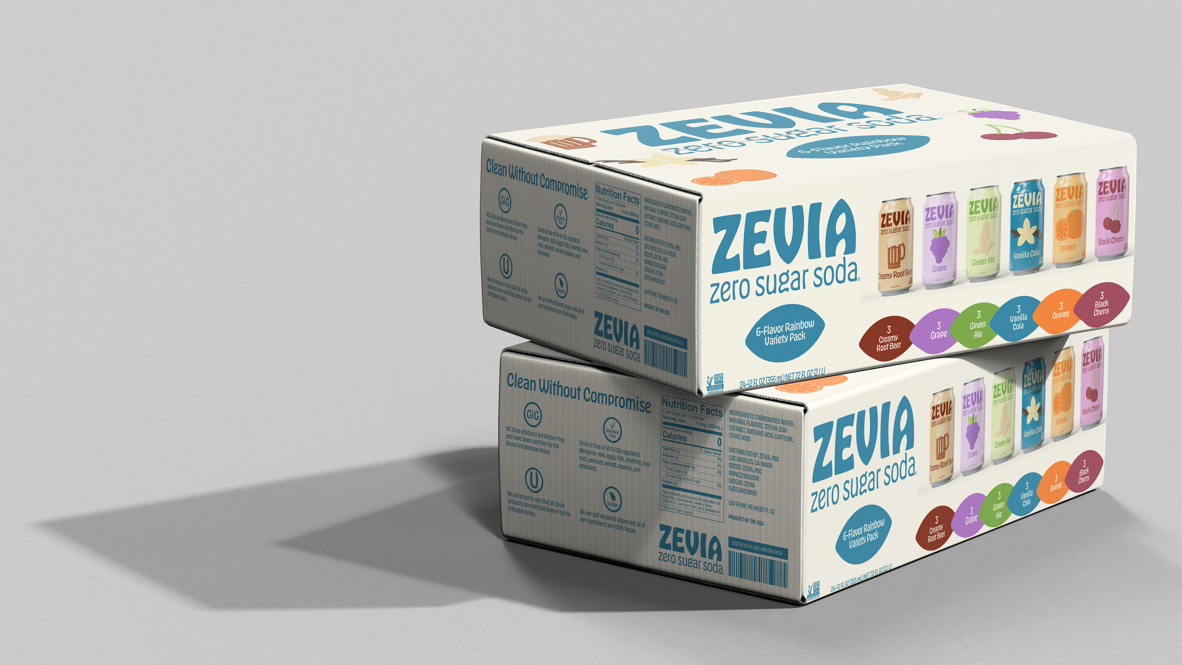
Zevia is a zero-sugar soda brand positioned as a healthier alternative to traditional soft drinks. For this project, I reimagined the brand with a clearly defined target audience: health-conscious consumers, including individuals with food sensitivities, as well as shoppers drawn to natural and specialty retailers such as Whole Foods. The visual direction incorporates a subtly feminine aesthetic while remaining intentionally inclusive, ensuring broad appeal without being limited to a single demographic.
Deliverables
Logos/Brand Identity/Packaging Design
Programs
Illustrator/Photoshop/Figma
Original Zevia Logo
Logo
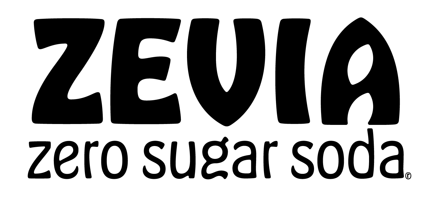
For the logo, I used the Hobeaux typeface as the foundation of the wordmark, making subtle refinements to individual letterforms to better support the rebrand's tone and visual direction. I selected this typeface for its organic, leaf-like qualities, which reinforce the brand's natural, health-focused identity
For the logo, I used the Hobeaux typeface as the foundation of the wordmark, making subtle refinements to individual letterforms to better support the rebrand's tone and visual direction. I selected this typeface for its organic, leaf-like qualities, which reinforce the brand's natural, health-focused identity
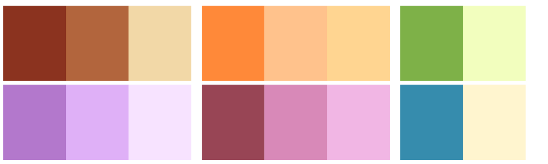
Color Palette
I chose a soft color palette and implemented a primarily monochromatic scheme for each flavor to create a cohesive, calming visual identity. This approach allows individual flavors to remain distinct while maintaining overall brand consistency and a refined, approachable aesthetic.